It’s not research it’s brand insight

I’ve spent all morning today with the extraordinarily clever Barrie and Vicky from Park Lane Research who have been teaching us all about Brand Insight.

In the old days, this may have come under the misnomer of market research, but it’s been rebranded and seems to work a bit better now.

As we start to work on bigger and bigger projects as a design and branding business, we are increasingly asked to justify our ‘gut feel’ and experience school of advice with some real figures and some data that is valid (rather than assumed).

The real difference between brand insight and research is twofold for me.

1. There’s no fence to sit on, no focus group to hide behind and no weasel to worm you out of a difficult question. You simply speak to your customers or perhaps those who aren’t your customers – and then find out what they think. You listen and then act. Not use them as a crutch because you’ve already acted and need a friend on your side.

2. The second and most exciting one for me is that brand insight looks to the future. Every example I’ve seen of market research seems to be retrospective. It’s taking an historical perspective on what has happened. Brand insight is far more about making a more informed decision about what is likely to happen in the future.

I am an avid fan of Twitter and believe that I learn something new almost every day, but yesterday was a bit of an epiphany day for me with one of the most remarkable comments I have ever read – that will genuinely change the way I look at branding going forward.

It came from someone I had never met before whose name is Joelle Nebbe-Mornod and can be found on Twitter under the name of ‘iphigenie’ and who is blogging here.

What she said was …

‘The perverse effect of branding is that it creates a need for control – control every bit of message, because a brand is so fragile’

I talk a lot about message management, and edged towards control, but had never considered a brand to be fragile, even though I have written about brands for years. This statement has made me think that if we are to protect any brand, any product and any organisation in what is becoming the economists perfect market economy – where all the punters have all the information they need to make the perfect buying decision, we have to be pretty clear on our facts.

Hopefully, with our new brand insight partners, we’ll move beyond simple control, we’ll move to freedom. We simply want to produce better products that we are happy to put our name, brand or mark to. The better we make the products, the stronger we make the brand. If it is cool, you love it, it makes you feel good and it is better at what it does than anything else on the market, surely everyone wins?

Except the cheapskate competition.

We can only hope. Thanks for the following picture from Patrick Looney.

We can only Hope
We can only Hope

Why Setanta failed

Setanta was always going to be a difficult launch for a number of reasons.

They were coming into a market that was already dominated by one really major player with massive financial muscle. Sky.

And they really failed to differentiate themselves. They presented more as a Sky wannabe than as a unique brand in its own right. Their initial advertising was more to do with people getting the name wrong than their unique content.

Was it Sultana, Santana or just Des Lynam being paid to add some much loved but misguided British celebrity? For me, it was a combination of all of them. A big boobed model chucking some pies down on a chuck wagon counter is not differentiation, its stupid, silly sexploitation that speaks down to its potential customers.

But worst of all, we were expected to pay extra for the privilege of being a customer. As Des says ‘Under a tenner a month and no annual contract – with games that Sky doesn’t have’.

By comparing themselves to Sky, they were introducing doubt into people’s mind straight away. Were they Sky? Were they as good as Sky? And what games or sports events do they actually have that people wanted to watch?

For me as an Oxford United fan, it was great seeing them all the time on Setanta in the mightily overblown Blue Square Premier. But I only got it as part of my Virgin Media package and I’m not sure I would have paid extra for it – even for the sheer joy of watching Oxford lose almost every time they played in front of the Sultana cameras.

So what makes a brand succeed?

It is clear in what it stands for – Setanta was not.

It is differentiated in the market – Setanta was not.

It is of exceptional quality – Setanta was not. (or they failed to sell this aspect by their marketing)

People can say the name without embarrassment – Cleary Setanta did not fall into this category – they had to advertise to people as to how to pronounce the name rather than concentrate on the content.

So, like ITV digital, British Satellite Broadcasting (BSB) – even with their squarial, the Betamax Video format, HD DVD and for me the whole concept of Freesat all failed or will fail because they have got one or more elements of a great brand wrong.

In my mind Setanta was always going to fail, it was just a matter of time. Lets see what ESPN do with the UK market?

And perhaps more importantly, lets see how the FA squirm out of the mess they’ve created by chasing the cash, rather than concentrating on the quality.

Fine just isn’t good enough

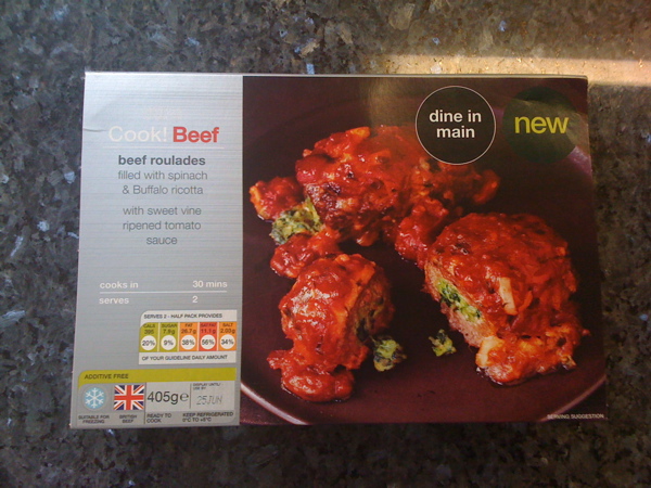
This is not a Beef Roulade, this is an M&S beef roulades filled with spinach and Buffalo ricotta

Marks and Spencer have been fighting back over the last few years with their strong campaign that says “its not just a thingy, its an M&S thingy” and it has felt like its been working. I only say this, because a brand essence has been really embedded when you hear kids and adults alike using the expression in everyday conversation.

Now M&S have been trying to help us in these recessionary times by reducing te price of the ‘Dine IN’ menu from £15 to £10.

But I have often argued on here and in other places that it will only work if the product your are peddling is actually as good as you promise.

Father’s Day yesterday and after a nice walk, what could be nicer than popping into our local M&S for their ‘Dine in for £10 deal’? Great idea but incredibly bland (at best and horrid at worst) food and that for me, is the start of the decline for the whole of the M&S brand.

We decided to start with the Beef Roulade.

mmmm Sounds nice.

It’s not a normal Beef Roulade remember, its an M&S beef roulades filled with spinach and Buffalo ricotta, served in a sweet vine ripened tomato sauce. (random capitalisation followed exactly from the packaging).

Unfortunately it wasn’t nice. It was pretty horrible and had the texture of a rolled up beefburger with some tangy cheesy peas stuffed up the middle of it.

The pudding was fine, the wine was fine and even the new potatoes were fine. But that’s it, they were just fine.

Fine is just not good enough. Fine is failing. Fine is forgettable and fine is feeling like I won’t bother next time.

To maintain or even grow a brand you have to do brilliant stuff, over and over again.

In the paraphrased words of Tony Parsons from his book Man and Wife, you have to allow your customers to fall in love over and over again.

When you make brand promises as big as M&S have been making, you have to not only wine and dine them, you have to be the perfect date, who brings flowers to you, says nice things to the future in laws and remembers all the little brothers and sisters birthdays. You have to be perfect. Not fine. Perfect.

My dine in for £10 meal was far from perfect. The main course wasn’t even fine.

It wasn’t just a meal and it wasn’t just an M&S meal, it was an entirely forgettable M&S meal.

Hit the Hut, or hit the depths of desperation.

Branding is a relatively simple discipline.

Come up with an idea that is different, is clear what you are about, clear what you stand for and then keep doing it well.

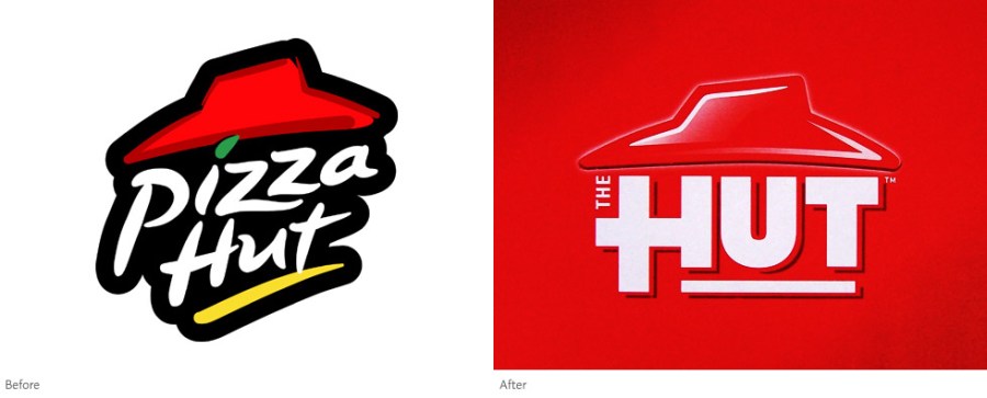
So when Pizza Hut – which is about as clear as you can get for role definitions – decided to rebrand to become ‘The Hut’ is this brilliant branding or death by a thousand cuts?

Well, in my opinion it is the sign that they have reached new depths of desperation and are scrabbling around in a vain attempt to not offend anyone. In doing so, I believe that all they have achieved is to lose the reason they may have actually attracted anyone in the first place.

With Pizza Hut, you knew it stood for (horrid) pizza and a big central thing of crap salad that students use for competitions that drift into engineering challenges where they use lettuce to cantilever as much onto their plate as possible, cover it in bacon bits and thousand island and then promptly leave the whole lot, as they are totally podged out on their bloaty fat based pizza.

And in these terribly right on times we know we should eat more salad and much less ‘Pie’ – But it was a treat. An occasional treat hopefully. You weren’t meant to eat it every day, unless you wanted to end up like Mr Creosotes fat brother.

So blanding it down to ‘The Hut’ won’t fool anyone when you are still serving up student friendly salad, selling pizza by the square metre and throwing in a few lonely tomato pastas for the salad dodgers to look at and decline.

Look at the logos. They are the same but the Pizza has hidden under the roof, or it’s got so fat it can’t even get out. At least the old logo had some token greenery in it. The new one proclaims a communist state for crap food and lazy branding.

The art of blanding in action - Welcome to the Hut

This is not a brand evolution, it’s a last roll of the dice for a brand that’s dying under a weight of right on-ness and continuing to produce lazy food that is more about mass blanding than creating mass desire through devoted followers.

Last time I ate in one I was on my way back from a football tour with three hungry eight year olds. Even they left the salad.

I won’t be hitting the Hut in a hurry.

There’s a different way to look at everything

I don’t normally read ‘jokes’ that are sent via email, but this one made me think about us having preconceived ideas and about looking at things differently. Often the simplest answers to any branding problem are right under our nose, but we overlook them because we are looking in the wrong place, or even looking for a solution we would expect. So here’s the ‘story’….

An old Italian lived alone in  New Jersey. He wanted to plant his annual  tomato garden, but it was very difficult work, as the ground was hard. His only son, Vincent, who used to help him, was in prison. The old man wrote a letter to his son and described his predicament:

Dear Vincent,  
I am feeling pretty sad, because it looks like I won’t be able to plant my tomato garden this year. I’m just getting too old to be digging up a garden plot. I know if you were here my troubles would be over. I know you would be happy to dig the plot for me, like in the old days.
Love, Papa

A few days later he received a letter from his son.

Dear Pop,
Don’t dig up that garden. That’s where the bodies are buried.
Love,
Vinnie

   
At 4 a.m. The next morning, FBI agents and local police arrived and dug up the entire area without finding any bodies. They apologized to the old man and left.

That same day the old man received another letter from his son.

Dear Pop,
Go ahead and plant the tomatoes now. That’s the best I could do under the circumstances.  
Love you,
Vinnie

Okay, I know its a bit of a cliche, but it is a nice little ditty to remind us that obvious things aren’t always the right things, and coversely, the right things may often be obvious if we look in the right way.

Brian Howard Clough and the brand that is Nottingham

Brian Clough and his trademark green Jersey

I have just read the book ‘The Damned United’ about Brian Clough’s time at Leeds United. To any of you who have read this blog for a while, you’ll realise that I am a bit of a fan of Cloughie’s, so wanted to look at him as a brand to see what he stood for and what made him stand out – two vital elements for any branding programme.

I have read two others about him in the past and will now publicy claim to be one of the people that has edited his Wikipedia page to ensure historical accuracy.

The first thing that struck me was I could see why the family didn’t like the book as it paints Cloughie as a heavy drinking, smoking maniac – which he clearly was not. It does however paint him as a very strong family man – which I am far more certain he was.

So what did he stand for in a brand context?

He stood for straight talking – never letting anyone misunderstand what he was trying to say. Some of his quotes were just legendary – we will be referring to them for many, many generations to come. Perhaps it has taken losing him to realise the brilliance (and accuracy/honesty) of some of the things he said. Interestingly for us, this ‘straight talking’ came out as a feature of Nottingham people when we did the research for the brand for Nottingham back in 2005.

He stood for doing things brilliantly and his own way – whether this was as a father, a player or as a manager.

And for me, he stood for consistency. You always knew what type of reaction you were going to get – even if that reaction was to be an over-reaction.

These three values, would be the making of any brand these days – consciously or sub-consciously – any brand that did these three things would be half way to success.

So what made him stand out?

It could be the green jumper – a remnant of his time at Leeds if the book is to be believed – to get back at Don Revie who believed the colour green was unlucky – and is actually an old Leeds United goalkeepers jersey. All of the iconic pictures of the man show him in this top, from training ground to European Cup success with Forest. In his early days at Derby he was never out of his suit and tie.

But I’d like to believe that he stood out for just doing things so well. I met him once in a newsagent in West Bridgford and I was with my then seven year old daughter wearing her Forest top with her name on her back (a gift from the club to encourage young fans and financed by Capital One) and he was lovely to her. She stood there in awe as this enormously famous man, got down and spoke to her face to face – on her level – and she loved him for it.

You can see a different interpretation of his consistency and success living on through Nigel with his time at Burton and by what he seems to be quietly building at Derby County.

I think we all know, there was a bit of a wobble at the end. It all went a bit wrong at Forest and he lost a battle to drink – but so what? He was a slightly flawed genius.

But he was still a genius, who will be remembered for the great things he did, not the few bad things

Brian Clough is, for me, one of the best brands the City and the people of Nottingham have ever had. I think it is just a question of who is going to make something of it first.

Brylcreem needs to live its values

My 11 year old son Ted is playing Danny Zuko in a production of Grease. The house is full of tight fighting black trousers, tight fitting white t-shirt and a perfect leather jacket. So to complete the part with his hair (that he has been growing for two months) where else could I go but to Brylcreem. The haircare brand I would always associate with the era, the film and slicked back hair in general.

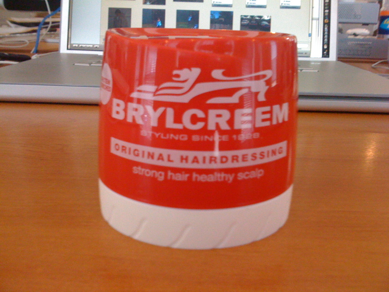
Brylcreem - Yours for only £1.00 at Wilko's - WHY?

Now, if you know me, you’ll realise that haircare products are not too much of a problem for me, being rather short in the barnet department. But I like to keep abreast of what’s going on in the world of brands and advertising. I’ve seen the latest ads for the product implying an effortless life, which just ooze coolness.

But when I went to buy some of the stuff in my local Wilkos (Wilkinsons to you and me) they had it discounted to £1.00.

Why?

For what reason did they need to do that?

How would that help them build their brand that they are spending a fortune advertising?

How would that reinforce the cool, effortless brand values they are portraying?

If they needed to shift some stock, why not add some value by bundling it with another product as a trial. They had a sister product (equally disinteresting to me in that it is more bloody hair gel) at £2.79, so why not add a mini trial product of their more premium product.

Why not get me to buy some of their lovely ‘Scruffing Paste’ – Because I need help getting my hair scruffy!

Everyone loves a bargain, but it will KILL your brand if you constantly discount.

Discounting damages brands and in an article I wrote back in February, my research showed it takes seven years to recover from a discounted price.

I bought a black comb too (again, not for me i hasten to add). They could have thrown that in couldn’t they?

Blogging and brand values

There seems to be a lot of blogging going on a Purple Circle at the moment and it’s all to do with some of our own brand values – being passionate and actually daring to have an opinion.

One of our problems with research has always been that it is often used as a tool to hide behind and not as a platform to launch something bold, innovative and different – That’s why we’ll be talking about Purple Circle Brand Insight that we’ll be launching in a few weeks.

So at Purple Circle, we have always encouraged people to say what they think, because it’s the right thing to do, and not necessarily because it’s always the right thing to say. This makes some clients feel uncomfortable but makes others far more comfortable in the knowledge they are paying for (and getting) honest answers and not a bunch of flannel from yes men/women.

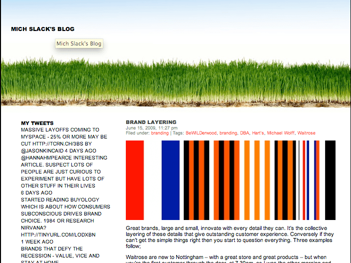
So Michael Slack has started his own blog at www.michslack.co.uk about branding and business, with his first piece being about brand layering, which you can read here.


Michael Slack's Blog at http://michslack.co.uk

Abi Jackson will be writing about more esoteric design stuff in her blog called Pretty Damn Fine with her first piece being about Sanderson designs, you can read that here.


Abi Jackson's Pretty Damn Fine Blog at http://prettydamnfine.co.uk/

So why all the blogging?

Well, simple really. Our clients are asking about how they can get a more clear personality online, about how they can work more cleverly within the social media environments, so what better way to advise than practice what we preach in order to understand it more fully ourselves.

Oh, and that’s not far from another of our brand values either.

Malcolm Gladwell – Outliers – Book review

Maybe I’m biased because I saw Malcolm Gladwell deliver some of this book at a presentation in London earlier in the year, but I have to say that this is one of the most enjoyable ‘business’ style books I have ever read.

It’s not just because he writes so beautifully using descriptions that make you double take and look at the way he has described difficult concepts in such simple terms, but because he makes sense of the many seemingly random subjects he covers.

Has it got any direct relevance to branding? Well probably not, but it does teach you an awful lot.

It’s not the big things that matter, it’s always the series of little things that add up to make one huge success or one huge mistake. In effect, you make your own luck, as long as you know which bits to manage.

Success isn’t an accident (even if it looks like it may be), it’s always about a series of small things happening in the right way at the right time, that sometimes you can only see by looking back at them. I’m not much of a rear view advocate, but in this case, by looking back, you learn a hell of a lot about how to behave when you’re going forward.

If you want to read some more of his musing, then have a look at his site here, or alternatively if you want to hop straight in and buy the book – which I absolutely recommend – then you can buy it from Amazon here.