Slow Cow v. Red Bull – a brand perspective

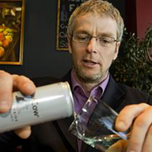
Lino Fleury Troublemaker in chief at Slow Cow
Lino Fleury Troublemaker in chief at Slow Cow - The anti energy drink

There’s a battle going on about the branding of livestock based named drinks and its all been started by a Canadian man called Lino Fleury – a name for someone whose going to be different if ever there was one.

It’s all to do with who owns what ‘properties’ or ‘brand values’ in an energy drink.

On the one hand Lino’s new baby ‘Slow Cow’ is an anti energy drink. A concoction he has created that according to his story contains L-Theanine, an amino acid found in tea plants that’s meant to help you achieve a relaxed, focused state of mind. He’s even got some friendly doctor to say it is probably natures best kept secret. But I don’t actually believe that and I’m pretty sure he doesn’t either – surely nature’s best kept secret wouldn’t have been found yet?
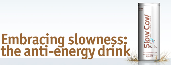
Slow Cow Ad - Everything that Red Bull isn't

For some reason, the people at Red Bull are none too impressed and have sent our hero Lino a notice to cease and desist. Even though for me, the brand values are at the opposite end of the spectrum.

But I absolutely believe they haven’t got a leg to stand on as the entire basis of the branding is completely different. They haven’t got a wing or a prayer of succeeding in front of any competent judge.

The brand basis of red Bull is to help you achieve more, to push yourself beyond normal limits. Their sponsorship of the Air Race series, F1 cars and any seemingly mad adventurous activity has to confirm this. For me, its entire reason for being is to convey energetic enthusiasm.
Red Bull Air Race - Its energy all the way

Their active ingredient of Taurine is widely copied in every generic ‘energy’ drink in any supermarket. Tesco settled out of court with Red Bull in 2007 for an undisclosed sum for apparently being too close in design with their Tesco Kick energy drink – but that’s more likely to be because they sell red Bull and didn’t want to lose the contract.

Aldi sell a six pack of Red Thunder (for £1.49!) which comes in identical sized and coloured cans to those of Red Bull, but as they don’t sell the branded product, they are unlikely to decease or delist!

Slow Cow, at the total opposite end of the scale, is all about taking time out, about slowing down and maybe even taking yourself a little less seriously. It’s about marking a time to begin relaxing rather than to begin being a bit excitable. Who would try and look ‘cooler’ by drinking a drink called, Fat Sloth, Ugly Dog, or spunky Monkey – let alone Slow Cow?

I would also counter the argument even more strongly that the packs look similar. They don’t. One is cream and the other is red, blue and silver. If you confused the two of them side by side, you would be stupid or lying under oath. The only similarity I can see is that they sit on the same beverage shelf and they are in the same sized can.

Beans come in the same sized can as peaches and are also sold in supermarkets, but you would hopefully think it was yourself at fault if you accidentally had them on toast, not the people who put them in the can in the first place.

This is bad PR by Red Bull and very clever PR by Lino Fleury. The two products are literally chalk and cheese and any talk about them being in the same trading space is utter, utter nonsense.

What the F**K is Social Media: One Year Later – The lessons

This is one of the most exciting and informative presentations about Social media I have ever seen. There are so many lessons to come from it that it seems obvious to pick to what I think are the main few for us to learn from in case you don’t have time to go through it yourself.

1. If your product is crap, no amount of social media will make it less crap.

2. Listening is the most important thing you can do. Social media is about building dialogue and not diatribe. As innocent said here, when you are talking, you are not learning. Most research departments do not send out the emails, it’s the sales departments and they rarely ever speak.

3. Sending emails from ‘do not reply’ addresses is just plain rude and bad for business. What you are saying is that ‘We are speaking and not interested in what you are saying, so shut up’ – unless you want to place an order – in which case ring this 0800 number or click through to our friendly smiling website.

4. 85% of social media users have said that they expect companies to have a social media presence and then use it to actually interact.

5. Having a strategy to engage is the way forward. Look at all the social media options, decide what is right for you and then dive in.

6. Stop thinking social media campaigns and start thinking social media conversations.

7. And the three final rules in summary.

Listen
Engage
Measure

If you don’t measure its effect, how do you know if its working?

And thanks to Andy Hanselman for showing me this presentation via Twitter.

Actually, you can polish a turd!

Wilkos has for years been the dowdy daughter of the British high street, toiling away as a cheap hardware store with no particular positioning and not enough real reasons to visit them regularly. Not quite posh enough to be John Lewis and a (big) step above the Poundland and super low price retailers.

The lovely Old Wilkos storefront

But, when Woolworths died, Wilkos made their move.

And they have proved that you can occasionally polish a turd. The new branding created by Jupiter has given them a much more youthful new look that will have a positive effect in many ways. It feels more like an Aldi than an Argos and will hopefully deliver them the growth they deserve.

Wilkos store front - like Woolies with evolution

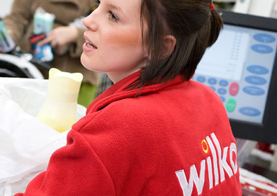
The staff must surely feel far more motivated in their new colours than the previous red/yellow cheapo combo.

The new Wilkos staff uniform

The customers will fee less embarrassed about being seen with a WIlkos bag and with good PR could even help themselves position their purchase as ‘discerning or savvy chic’ rather than the ‘best kept secret’ on the low rent end of the high street.

They seem to have so many things right that it’s like seeing what Woolworths should have become had they evolved rather than allow themselves to curl up and wait to die. Wilkos have Pick and Mix, but it takes up a small proportion of the store and not the huge area Woolies devoted to it before their demise. Yes, it’s high margin selling sweets, but you can only shift so much of them!

And, like any really good retailer they have concentrated on value rather than price. Goods of an appropriate quality and at a sensible price.

The only downside for me is the rather horrid queuing system you have to endure in order to pay. It all looks a bit like a bad bank. Maybe they’ll do like Natwest and take the clocks out so no-one can see how long they are queuing for? or in a more positive light, perhaps the softer, more airy approach of TK Maxx or even Primark would be a better solution?

Anyway, good work Jupiter and good luck Wilkos. It takes a brave (and extremely sensible) client to implement such a radical change.

Thanks for the old Wilkos image to the lovely people of Zyra

Coca Cola Branding through the ages

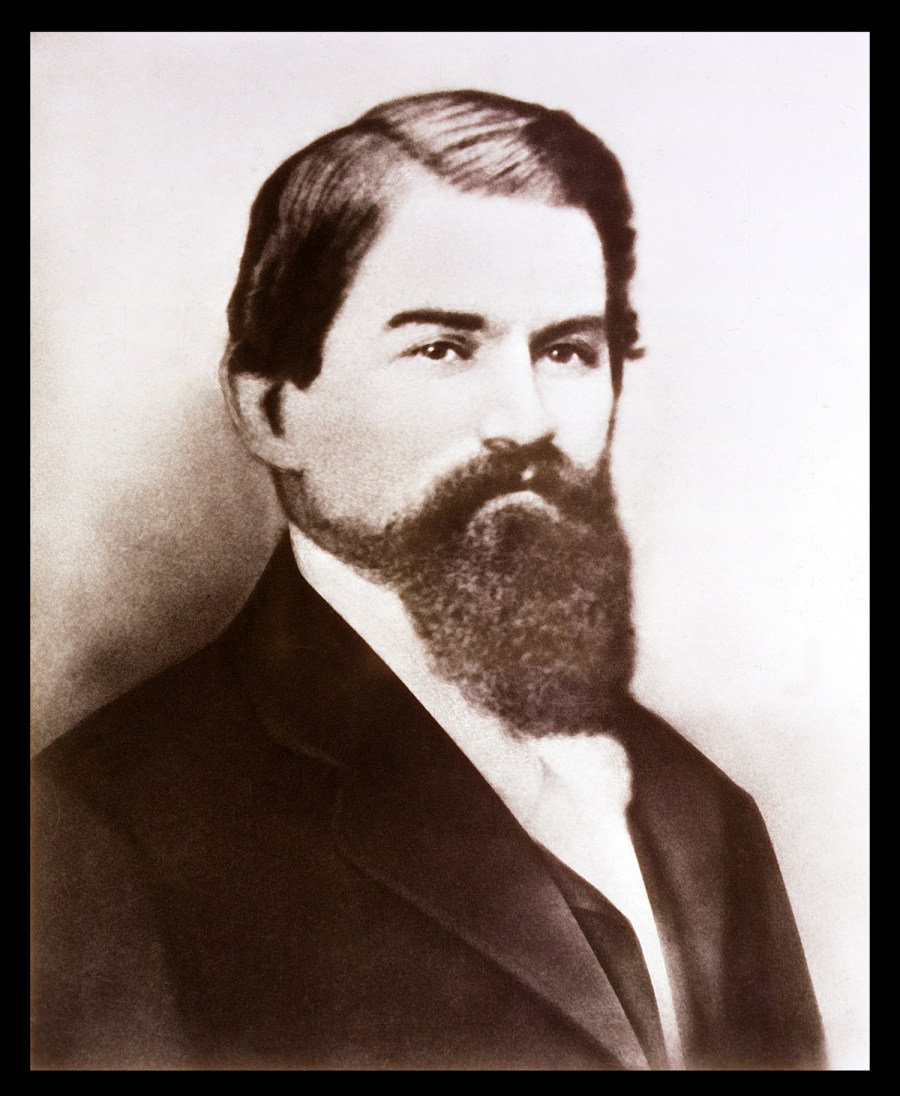
Dr John Stith Pemberton - Gave birth to Coca Cola and started the Cola Wars
Dr John Stith Pemberton – Gave birth to Coca Cola and started the Cola Wars

On May 8th 1886, a Dr John Stith Pemberton, a pharmacist, gave birth to the Cola Wars when he made a new syrup for the original Coca Cola and sold it down the road at Jacobs pharmacy. It was many years before it became the enormously powerful brand it is today.

What is one of the most interesting points for me however is that the logo element was actually produced by his bookkeeper who thought he could see something in the proximity of the two C’s and with his own scripted handwriting, created the logo for use in the Atlanta Journal to invite the citizens to try their new refreshing beverage. As you can see, this ‘logo’ is almost the same as the one we see today.

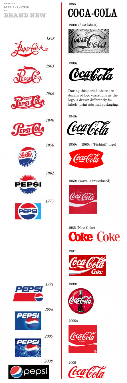
Meanwhile in 1898, over in New Bern, North Carolina, Pepsi was invented by another pharmacist Caleb Bradham. It was originally launched as Brad’s drink, but later became Pepsi Cola, named after the two main ingredients of Pepsin, the digestive enzyme and Kola nuts. Again it was aimed at a market looking for a refreshing drink that had some beneficial effects. The logos at this point are strikingly similar, to the point of Pepsi’s looking remarkably like a copy of Coke’s.

But around about here, their stories seem to split. Coca Cola stuck to their mission and continued to modernise to reflect the needs and desires of the era by changing the context of their traditional logo. Pepsi on the other hand, tried to modernise by constantly changing the logo and the context.

Pepsi and Coke logos throughout their history

In the 1980’s, during the time of Roger Enrico’s stewardship, Pepsi became convinced that their difference was their taste, spending the next ten years promoting just this one point and may even have been the reason that Coke, changed their recipe to one of their few historical mistakes that is ‘New Coke’. You can read a bit more about this here.

But by constantly trying to change everything about their product to appeal to become the choice of the (next) new generation, Pepsi effectively created a continual churn of their existing customers. The Pepsi logo that seems most relevant to me is the one from 1973 and the one for my kids will probably become the one from 2005.

The lesson here is simple. Coca Cola are the market leader and have been throughout their history. They have done this by continuing to build on their original values. The logo has evolved, but never changed so radically that it will lose its connection with the previous generation. Because of this brand continuity, Coca Cola will always mean something similar to each of us.

If you blind taste test Cola from Aldi at £0.25 per bottle and compare it to Coke at £1.09 per bottle, they are not that different, so like I said with the branding of cigarettes, it has to be to do with the brand that is the difference, or we would always buy the cheaper alternative. We don’t though, because the branded values dribble down on us and give us a bit of their magic.

Branding is not about logos, it’s about the consistent delivery of values to allow you to gain a feeling or emotion from it. The logo is only the symbol to show you have arrived at that branded experience.

The logo is therefore not the most important element of any brand, it’s the continual reinforcement of those values.

Pepsi’s mistake has been that by constantly changing the logo, they have changed the symbol of arrival.

As such, every time they change it, they create a level of uncertainty in a potential customer, rather like going into a pub or office you don’t know, that it may not be to your taste. You will naturally ask yourself ‘Will it be the Pepsi I know? Or have they changed it to make it more relevant to a new more exciting and younger audience? Will I look silly if I drink it? My very own equivalent of dad dancing in the wrong room.

Changing logos is a mistake, that Pepsi have practiced for year after year after year. For me, this is why they will always be trying to follow Coca Cola’s lead.

UPDATED

It would appear from new information that my previous chart showing the branding of Pepsi v. Coke through the ages was wrong. Shock Horror, they have actually changed the logo over the years. Not much, but still amazingly consistent considering the length of time.

Thanks to Under Consideration for doing all the hard work.

Coke and Pepsi logos through the years

Update 21 April 2016

It’s been announced that Coca Cola are undergoing a radical new look and feel again.  What is really interesting to me in this is that their idea of a radical rethink is to move some of the colouring around on their trademark bottles and cans. They are still leaving the logo element of the brand almost completely untouched as they have done throughout their entire history.

coke-bottles-april-2106
Coke updated bottles April 2106
coke-cans-april-2016
Coke updated cans April 2016

You can cut the price, but don’t cut the little things

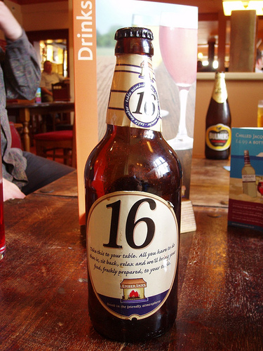
An Ember Inns bottle table marker

I read a great article on Brand Strategy Insider entitled ‘Customer Experience Defining Value In Retail’ Where the writer gives a great example as to how he can tell whether a restaurant is in trouble. He claims they get rid of the rustic rolls in favour of a more ‘stock’ white item.

In the grand scheme of things, this may not seem like much of a change, but for someone who knows what they are looking at, it is a strong signal that things are going from bad to worse.

A similar thing happened to us at the weekend. We were 12 miles into our 15 mile walk and the Apple Tree Pub (Part of the Ember Inns Chain) appeared before us, beckoning us in for lunch and a welcoming pint. And then we saw the sign – two meals for £7 Mon-Sat 12-5pm – surely a brilliant idea?

So we thought we may as well give it a go. Two naked chicken burgers sounded good and we’d earned our calories with the walk. A couple of pints of Mansfield bitter also sounded nice. Now when the food came (really very quickly) it was as badly presented as any food as I’ve ever seen.

The food itself was lovely. Well cooked chicken, fresh bun, clean chips and clean plate. But that was it. Not even a hint of a salad garnish. Perhaps this was the naked part? By missing that off they made it feel like a fast food dish rather than a great value pub meal. At that price it could compete with any McDonalds or Burger King any day, but it didn’t give you that warm feeling of ambience from a pub, just that slightly grubby feeling you get if you accidentally succumb to fast food hell.

It sounds like I’m really nit picking – and that’s because I am.

Ember Inns is one of the many brands in the Mitchells and Butler stable and they should know better. They own All Bar One, Harvester, Toby Vintage Inns and many more.

Little cuts in service or quality are ALWAYS detected by clients in the end. You may think you’re getting away with it and no-one will notice.

Niall Fitzgerald, the former Chairman of Unilever said that he has sat through hundreds of presentations where researchers and analysts insist that customers will not notice if you make this change or that small tweak, but they do. They always do.

And we tend to tell others about it too.

Thanks To Ewan M for the use of his Ember Inns bottle table marker image

Welcome to the Nottingham Riviera brand

Any of us who have lived or worked in Nottingham for any length of time couldn’t help but notice that it isn’t terribly close to the seaside – and for me, this is the only part of living here that I have ever missed, having grown up in sunny, sandy Margate.

But now we have a brilliant solution. The seaside has come to us with the launch of the Nottingham Riviera yesterday.

Nottingham Riviera
Nottingham Riviera

And it looks brilliant, despite some dark clouds threatening the perfect seaside break inland.

Nottingham has worked hard over the years to dispel the ridiculous myths about its problems. All of which are based more around a tiny political boundary that distorts the figures than any real issues that any other growing city doesn’t face.

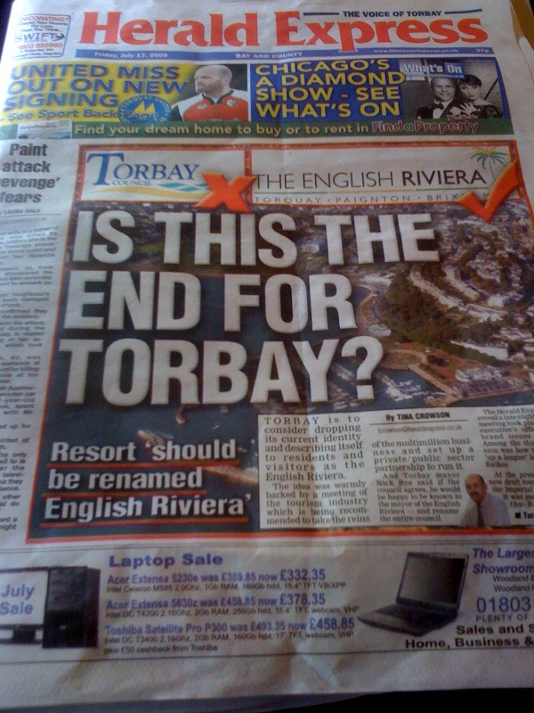
Perhaps if Nottingham gets the march on Torbay, who are apparently rebranding to become the English Riviera, the City could own this creative space before Torbay moves into it.

Is this the end for Torbay and is Nottingham the new English Riviera

But it seems that the Nottingham ‘Brand’s is becoming about innovation, which we have recommended for years as being the way for any brand or even any place to continue to be loved by its audience.

Yesterday also saw the arrival of Sven to the city to take over as Director of Football at Notts County – The oldest Football league club in the world. Again, great news (albeit a bit surreal) and another huge jaw dropping positive piece in the news about the city.

Today sees the first meeting of the Sheriff’s Commission – a panel put together specifically to show how Robin Hood can be more embedded into the fabric of the city. When we did the City brand some years ago, we were hammered for saying we did not have a strong enough offer for our green hero and choosing to focus on some of the other positives in the meantime. Thankfully this may now be coming to an end.

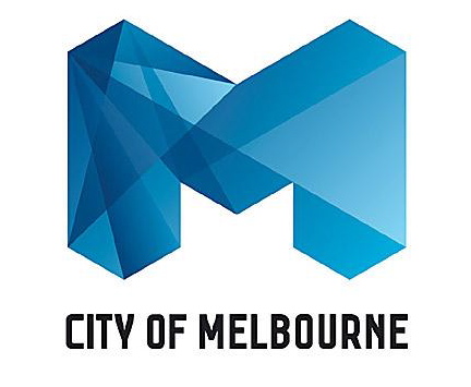
Melbourne have just undertaken their own rebrand through Landor and seem to be getting the usual bollocks about what it cost and how little effect it will have, but if this is what it takes for a city to start acting differently it’s money well spent.

The New Wonky 'M' Melbourne logo

Considering we’re meant to be in a recession, Nottingham genuinely feels like it is really fighting back. It’s become proud and innovative again and is building its brand by continuing to act differently and by actually being innovative.

Branding is about the sustained differentiation of a product, service or place. In this regard Nottingham is practicing some of the best branding you will see from any city anywhere.

Long may it continue.

Sometimes we need to look back through little people’s eyes

When we are little, we look at the world around us and everything seems enormous. Scarily big and scarily new – but its exciting. We’re looking and learning from everything we see, touch and do.

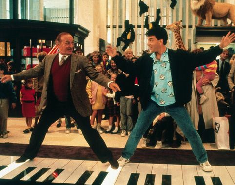
Tom Hanks, in the film Big, used this ability to look though a child’s eyes to create brilliant kids toys. He had the beautifully clean ideas and the sense of fun/wonder of a child and the experience and ability of an adult.

Tom Hanks - looking through a child's eyes

But late on in the film he realises he has lost it. He has accidentally become an adult and wrongly assumes that what an adult will like, a child will like, and perhaps more importantly – can afford.

It’s similar to starting a business. We look through excited young eyes, doing almost anything for anyone to pay the bills and make ends meet whilst learning our craft. If we’re lucky, the business grows up and we stay with it for the ride. But like the blogpost I wrote yesterday about stopping to think, I really believe that any business or brand owner needs to keep referring back to where it came from, to see if that is still directing its future.

One of my favourite brands in the world is Howies. They make beautiful quality clothes with a quirk and have always been aimed at the surf/skate market. Now I’m no skater or surfer but for me this is aspirational stuff and Howies makes me feel cool.

But I wonder whether they need to do a bit of Tom Hanks themselves and look at their business through their young eyes again.

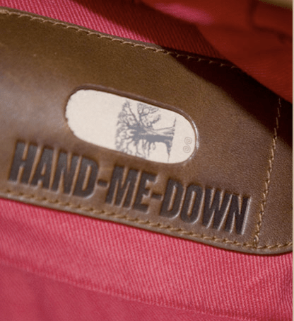
They have launched a range of bags and coats under the name of ‘Hand Me Down’. The name is given because they are in theory so good, you will be able to hand them down to future generations. But £400 for a Howies coat and £185 for a Howies laptop bag is pretty rich stuff by anyone’s standards, but a huge and possibly fatal price hike by Howies.

Howies 'Hand me down' Messenger Bag

I don’t put this down to their part ownership by Timberland, but more to do with them losing sight of their core audience.

You can buy a hugely aspirational Freitag bag made up from banners that were used at the Tate Gallery for £75 – how cool is that?

Or if you really want to push the boat out, stretch to a fully hand made leather work of art from Hard Graft that comes in the form of the ‘2UNFOLD multi-use leather laptop bag’ at £300 or so.

The beautiful hand made Hard Graft bag

We all need to keep our childish eyes focussed on our business or we are in danger of killing it, before it ever even reaches adulthood.

So please Howies. Remember us. The little people who have loved and lived your brand for years and years. Give us reasons to fall in love over and over again, not reasons to flirt with others.

Catching up is the new looking ahead

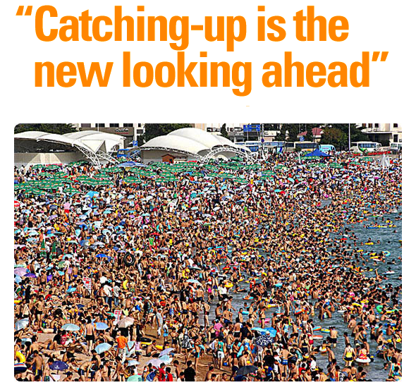
Catching up, whilst on the beach

Another brilliant piece from our hero’s at Trendwatching with their latest work entitled ‘Catching up is the new looking ahead’. It could be as simple as the fact that they are all about to go on holiday and didn’t quite get time to create a new trend briefing for all of us, but I like to think a little less cycnically about the way they work – particularly after my cynical attack on Swine Flu last week.

What they are essentially saying is that we are in a world that is moving at such a pace, that we are in danger of missing a huge number of potential opportunities that are already under our nose.

In the book Azazel by Isaac Asimov, (a writer better known for his Sci-fi books) he creates a devil that sits on your shoulder and grants your wishes. But they all have a slightly evil intent. In one particular example, a writer complains he would be far more efficient if he didn’t have to sit around waiting for anything. His wish is granted.

He puts his hand out and a cab arrives, he arrives at a restaurant is immediately seated and served – and he hates it. Pretty soon he is in ruins.

He has lost his time to think.

And when you are creating a brand, you have to have time to think.

You have to have time to walk away and see what your are doing is genuinely different, genuinely a good idea and genuinely what people want.

I just love this idea.

I have always thought that the quiet summer months are for drinking and relaxing in the sun, but perhaps if we use them for looking back at what we should have read, should have done and should be doing when we come back, it will make our businesses even more productive and successful.

Anyway, back off for a spin in my car to think about stuff.

Why is Alfa Romeo such a powerful drivers brand?


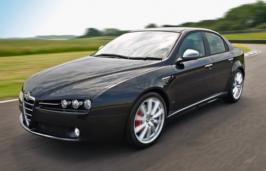
Alfa Romeo - far more than just a branding exercise

My car is being repaired at the moment after someone went into the back of it. They wrote their car off and we just need a new bumper. Mine is a bit of a tank, but it’s a big safe tank.

The hire car I have been given is an almost brand new Alfa Romeo 159 Saloon 2.4 JTDm 200 Lusso Q-Tronic 4dr – which is quite a mouthful, but one hell of a car. It goes like stink, makes an amazing Alfa like growl – despite being diesel – and looks beautiful.

Years ago, when I was 17, I worked in an Alfa Romeo dealership in Oxford called Cornerhouse Motors and as I was just the Saturday lad, was paid a commission for anyone who subsequently bought a car from my introduction. They also sold Mazda’s but I couldn’t ever have any feeling for them. They were all just a bit functional, like a solid domestic appliance.

Being a bit of a statto geek, I could memorise all of the facts about power, torque and relative speeds for the whole Alfa range, but the thing that earned me most was talking about the ‘soul’ of the car and the feeling you get when driving any Alfa. (For example I can still recall that the Alfasud Green Cloverleaf had 115 bhp which was higher per tonne than a Maserati Merak)

26 years later, this latest Alfa is no different. It has soul. Yes, I’m sure it is a Fiat underneath, the driving position is still a little ‘ape like’ and it won’t exactly be built to last for 250,000 miles like my tank, but that feeling it gives you is very hard to ignore.

I am totally taken with it, because it makes me feel like I haven’t given up and died and that driving can actually be cool again. For the first time in years, I drove miles out of my way to get home and am offering to drive the kids anywhere.

That’s far more than any brand can give you on its own. That’s years and years of embedding real values into a brand.

I’m sure Alfa Romeo will be one of the brands that Fiat may eventually cull as we move towards the worldwide homogenisation of everything. But it will be a disaster if it does. If you’ve never tried one, give me a call and I’ll pop round and take you out for a spin.

Any excuse.

Swine flu – It’s just brilliant branding by the drug companies

Swine flu - A safer for of unbranded flu
Swine flu - A safer form of unbranded flu

Call me a cynic if you want, but looking at the stats behind Swine flu, compared to the unbranded ‘seasonal flu’, you’re actually better off catching Swine flu.

According to the Guardian yesterday, The Chief Medical Officer, Professor Sir Liam Donaldson, stated that as a worst case, 30% of the UK population could be infected by the H1N1 virus, with 65,000 killed.

The best case scenario, according to Sir Liam is that only 5% of the population contract the virus, with 3,100 deaths.

Now 65,000 people sounds like quite a lot to me, but is actually only 0.1% of the population – and that’s the worst case – almost doomsday – like scenrario.

3,100 is still a large number and I wouldn’t dream of belittling the pain caused by any single one of those deaths, but it is 0.05% of the population – which is a tiny, tiny percentage.

Over the winter of 1999/2000 we had a really bad epidemic of unbranded flu break out in the UK and 21,000 people died, over and above the base level – but no-one in the media seemed to notice. A missed opportunity by the drug companies that they weren’t going to make again?

Is it media hype, very carefully managed PR by the drug companies, or just further proof that we have to have a name for everything, so we can gather together as a herd, to share the problem, under one common banner?

My feeling is that the drug companies are simply loving it. Who had ever heard of Tamiflu or Relenza before this ‘pandemic’ started? Let alone had pangs of guilt about not having any in stock in case any of our families contract it.

Even the word ‘pandemic’ is one designed to strike fear into the hearts of normal people. I personally know three people who have had various degrees of swine flu. All seem fine a few days/weeks on.

Flu is a killer anyway. It is a hideous way for those with underlying health problems to die, but that’s my point – it always has done and probably always will.

But it does feel like we’ve heard it all before and this is more to do with media and marketing hype than it is to do with reality. H5N1 or Bird flu was going to wipe us all out – yet only a few people died – and the Y2k bug was going to take out all of our computers at the end of the last millenium. But they didn’t. Yet, millions were spent in preparing for their coming, which never quite came.

As a branding and marketing exercise for the people at Roche who own Tamiflu or GSK, who own Relenza, they couldn’t have planned a better campaign if they tried.

Or am I being a huge cycnic?