Why does it cost more to repair things than to replace them?

I am open about the fact that I am a bit of a geeky bloke. I like to repair things. Actually I Like to take things apart and see how they work and as I have got older I have become (slightly) better at getting them back together and working again.

So if something breaks, I always start from the position of seeing if I can repair it. We all know this is a more environmental route don’t we?

But when my almost new Morphy Richards slow cooker crockpot broke (because you can’t use it on the hob to get it going – doh!!), I thought it would be a simple case of buying a new crockpot and that would be that.

So I stumbled around the Morphy Richards site and spares are listed as accessories there. It’s a ceramic pot. They break. Surely they should describe it as a replacement? I did eventually find one at £15.86 with the benefit of free delivery.
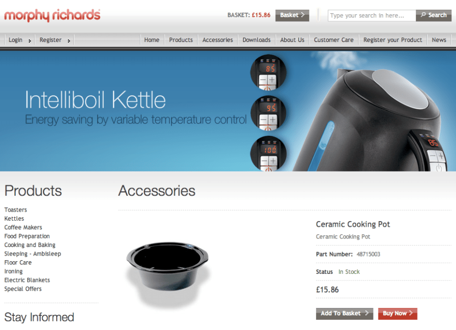
Buying spares and accessories from Morphy Richards

Spares 2 Go had one at the bargain price of £42.63
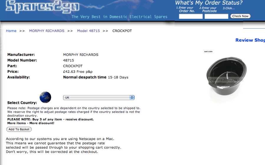
Buying one from Spares 2 Go will cost you twice as much as a new unit

And Buy Spares had one at the rather more attractive price of £15.99, but by the time you added £4.98 shipping, this came to a less attractive £21.97
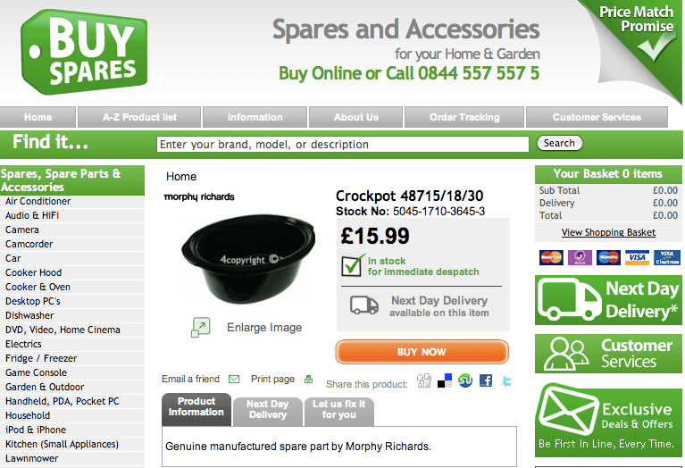
Getting closer. This part only costs a bit more than a whole new unit

And then we come to Amazon. A new one, from stock with free delivery for £19.99.
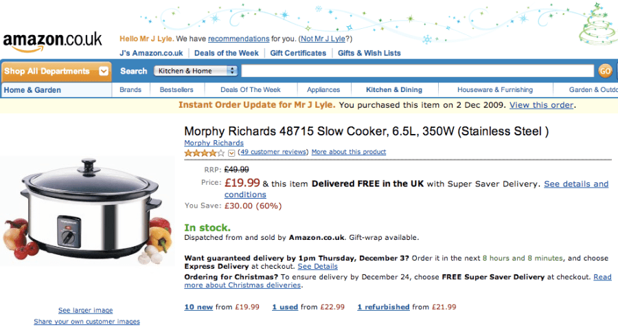
Amazon come in with a bargain price of £19.99

How do they do it?

For an extra £4.13 over the cost of the cheapest delivered replacement spare part, I get the whole of the rest of the unit in a shiny box with a new warranty all delivered to home within 3 days. So where is my incentive to repair?

I don’t want to turn this into a rant, but for any brand owner, it has to be a better long term proposition to make us stay with them by incentivising a repair.

I could just have easily gone away and bought another brand and all of the retailers have some stupidly priced products in the run up to the winter months.

If the price of the biggest and most breakable part was around half of the lowest price you could by the whole unit from scratch, there would be no debate, you’d get on and stick with it. But when it is virtually the same price, however well intentioned your repair/environmental principles, you’d be silly not to take a new one.

Marlboro and their deliberate programme of scarcity marketing

If any of you know me, you’ll know that I’ve been a struggling smoker for most of my adult life. It’s my own version of scarcity marketing, in that I find it quite easy to give it up for a month or so, and then think I’m missing out on something, so drift back into it and the cycle begins again.

I recently wrote a piece here about Knob Creek and their restricted supply which is pushing demand (and prices) up.

Well now, Marlboro are doing it with their website. You can only access this site if you are USA based and are prepared to add your social security details and full address to prove you are over 21 years of age (even though you can buy them at aged 18 years)


The very frustrating Marlboro website that i can get this far into, only to be told that as I don't live in the USA and can't prove i'm 21 or over, I can't access!

They don’t have a UK page at all. You can only get past the first page if you can say what state you are in and then give them a real zip code (rather than a series of random numbers).

And, according to their figures, its working wonders. The more we are told we can’t have something or shouldn’t do something, the more we strive to do/own it. It’s our own rebel reflex in action and I’m convinced its part of their plan. They make it seem like it’s really worth getting onto and then make you really jump through hoops to get registered.

It’s working so well they are now getting 1.5 million unique visitors a month and I haven’t got a clue what they are all dying to see, because I can’t get onto the site to find out.

Clever, very clever. But very frustrating.

If anyone can get in, can they let me know how they did it?

Even though I’m not smoking at the moment.

Thanks.

Learning from Apple’s brand – circa 1996

This is a set of guidelines released by Apple in December 1996 as to how you should go about building the perfect website. They still seem to ring rather true today, and if applied would improve many current websites.

The Apple guide as to how to design and build a website from 1996

A few of their lessons that they go into in some detail.

Take Advantage of Keywords
Provide a Directory of Your Site
Show Users Where They Are
Minimize the Need to Scroll and Resize
Avoid Dead Ends
Include Links to the Key Locations in Your Web Site
Use Familiar Terminology
Define a Language Style (or Use an Existing Style)

And many, many more good points

They do say however that you should Keep Pages Short, which is great in theory but perhaps not the best thing to do in order to make yourself as SEO friendly as you can be.

Considering this is nearly 13 years old and was sent to me as a piece of good practice, there is an astonishing amount we could still learn from if we implemented half their ideas today.

You can download your own copy with this link Apple_Web_Design_Guide.

Perhaps that’s why Apple is such a brilliant brand. It has clear thoughts and then sticks to them in all of its corporate and product communications.

The end of an era – another structural change quietly changes our buying behaviour

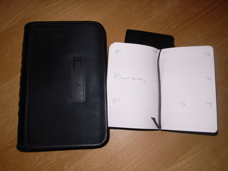
The end of an era as my Filofax is replaced by a Moleskine diary

It’s a bit of momentous day for me today as I have just been out and bought a Moleskine diary. This probably isn’t that momentous for most people, but it is an indication for me of a structural change in the way I work.

I bought a Filofax years ago – when I was still at college in fact – and have kept all of my diaries dating back over 20 years. I’ve seen off a few covers, but the format of the inners have remained broadly the same.

Over this 20 year period, I have now switched almost completely to a shared online diary – as most of us who work in groups have done too. Google Calendar is our calendar of choice and it works brilliantly. It allows others in the team to make appointments for me and then invite me along. When I get those invites, I add them to my Filofax diary, so the two should correspond perfectly.

But they never do.

Because I never carry my Filofax anymore.

It’s not that it has become any chunkier, it’s just that I now only carry a laptop bag with me 90% of the time, and this doesn’t have room in it for a big chunky Filofax. It does however have room for my new best friend the Moleskine notebook.

On my trip the US recently, I carried it everywhere and it is full of little notes and reminders of that trip as wel as ideas and notes for blog posts. It has quickly become a very treasured little possession. I liked it so much, that I have been out and bought the matching Moleskine diary. Week to view, with a detachable address book section in the back. On Amazon at a bit under £8.00. You too can be a bit like Hemingway yourself, by buying some of his heritage here.

I completely understand that this isn’t significant in any way to most people, but to me it shows that they way I buy and the way I behave is now different.

Filofax have changed and are doing lots of cool things with Twitter, Facebook and limited edition books, but they can’t really influence the size of the bag we carry and this alone has changed my behaviour.

I look at the branding work we do at Purple Circle. Yes it’s still branding. But it isn’t branding like we were doing 20 years ago. I’m looking at our own industry and wondering where the next structural change is going to come from. I suggest you do the same.

Two minutes to change your brand behaviour

The old ways of working are changing forever. I’m reading Seth Godin’s Purple Cow at the moment, which I know I should have read already, but I never quite got around to it before now. Sorry.

The long and short of the book seems to be that ‘if you always do what you’ve always done, you’ll no longer get what you always got’.

We don’t respond to print advertising anymore. We interact with each other online and we often come into contact with brands online. We don’t just want products that work, we want brands that make us feel good about ourselves, help us bed into our particular tribe we have identified we want to be part of and speak to us in a relevant voice.

All this, and at the same time, listening to what we have to say, because we the customer owns a brand these days, not the company who may own the production.

This short video sums it up beautifully. You have two minutes to change the way your brand behaves. Use them wisely.

Sixth sense ‘Minority Report’ user interface in the real world

In the 2002 film Minority Report, with Tom Cruise, We see the most amazing example of a totally intuitive interactive user interface. Here’s a clip for you to remind yourself of what a clever film it was and how quickly ideas that are being posed, are now being delivered.

I remember watching it at the time, thinking how incredible it would be if we all started relating to our embedded computer systems like this. It’s as though the boundary between reality and computer is being continually blurred.

But now this new TED lecture from Pattie Maes at MIT Media Lab, Fluid Interfaces Group (what a cool title that is!), shows that this virtual or even augmented reality is almost achievable now.

It starts off a bit slowly, but then you can hear the crowd gasping at what is possible. From something as simple as your own hand becoming a keypad, to your own shopping preferences being overlaid onto available shopping products.

She even references Minority Report and then goes on to prove that they can deliver it today, for about the same price as a conventional mobile phone!

I am looking at the brands we work with and thinking what endless possibilities this delivers and what endless problems we now have to overcome to allow them to speak with a common voice on yet another platform in which they operate.

BeWILDerwood – The last few days of the season

I was over at BeWILDerwood yesterday on the last Friday of half term and their last day where they were expecting a great crowd before they close for the season on Sunday.

There were 1600 people in and an amazing atmosphere. The night before BeWILDerwood had been awarded the title of the best large attraction in the East of England, beating Duxford Air Museum and Woburn Safari Park at the regional Enjoy England for Excellence Awards.

All of us on the broken bridge

Having spent time there when it was that busy. I’m not surprised. The children were having a great time, swinging and whooping in the woods and the Twiggle Team had put on free lantern making sessions for all, leading to a giant lantern parade through the woods as the light fell.

The crowds are on to make your own lantern

It was a magical procession, with well over 500 people parading happily through a totally unlit woods on their way home. They were lead by a giant lantern bat called Snagglefang.

DoodleTic leads the lantern procession with Snagglefang the Lantern Bat

It seems so simple to get children to play again and for their parents to play with them, yet many get it so wrong. BeWILDerwood proves it can be done beautifully and elegantly and without breaking the bank. Seven of us ate and drank at lunch for £32 and we ate well, with the biggest hot dog I have ever seen, made from a beautifully tasty award winning Norfolk sausage. It was as good as if you’d barbecued it yourself, having made the effort to get lovely ingredients first.

The slides were brilliant too and you can see from the face of young Charlie here, quite how much fun he’s having.

Charlie at speed on the Slippery Slope

I know I’m biased because we’ve been involved in BeWILDerwood from the outset, but to see the way that my kids played and our friends kids played and how they all slept on the way home, it was an absolutely brilliant day out for very many families. I love this place, my kids love this place and my friends all love this place and I’m not surprised it’s been recognised as the best in the east!

Bring on the new season.

And how cool does it look at night?

BeWILDerwood at night

The new logo for Burnley seems to have caused a bit of a stir

Burnley have bought a new ‘logo’ that isn’t really a logo but a clever rotating computer graphic. And it seems to have caused a bit of a stir judging by 70+ comments within a day of being shown on the Under Consideration website.

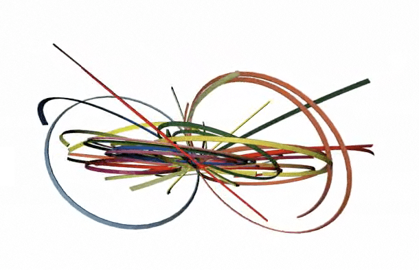
The new Burnley 'logo' made from some old bits of Atari graphics

I personally like it but do find it amazingly disturbing that Coun Gordon Birtwistle, leader of Burnley Council admitted that they had to beat off stiff competition to use the logo!. What? A bidding war for a logo that is being touted about?

He said ‘it signifies the town’s “intertwining” qualities’ Did he really? Or did the designer say this in a huge piece of post rationalisation?

Surely a graphic device has to represent it’s people. It has to be embedded and probably even designed within its community. Using clip art for logos isn’t new, it’s a massive retrograde step. All credit to the people who got interested parties to compete to use their icon.

Is it a nice piece? Yes, I think so.

Does it represent Burnley? Err no. It can’t it wasn’t designed for them, it was designed to sell, not to meet and exceed a brief.


Yell Hell – Will Yellow Pages Evolve or die?

A big pile of Yellow Pages, festering in a window

Yellow pages used to be one of those businesses that you relied upon to provide calls that lead to sales. They were at the top of their game, the top of their market and charged accordingly. We had many of our clients paying £600 plus for a tiny quarter column and in a single section. They were unionised so we had to provide flat artwork, with an NGA stamp on the back of it far later than anyone else in the industry.

It was worth the hassle though because it worked.

But now I’m sure that it doesn’t.

Yellow Pages started in 1966 as a supplement to the Brighton telephone book and spiralled upwards from there. In 2008, they produced 104 different regional copies and distributed them free to 28.4 million UK homes.

My new 2010 copy arrived on Thursday last week and was left on my doorstep. I looked at it for a day or so and then emptied into the recycling bin without even unwrapping it. I’m not alone. Every single person I have asked has done the same, so the advertisers money is literally being thrown away.

And that’s because the brand hasn’t evolved anywhere near fast enough to remain relevant. It’s currently swamped under a debt of £3.8bn and had an underlying loss of over £1bn last year. So why is it still insisting we need these doorstop directories and why are advertisers still paying to be unseen?

I can only conclude that if they are losing that much money, they are either paying too much to print them, too much to distribute them or their advertising revenue has fallen to a level a long way below breakeven. So they need to implement a massive and structural change to remain relevant to an audience that is behaving very differently to those that were around in 1966.

In 1993 they ran one of the most famous TV commercials ever, but surely poor Mr Hartley could now just buy it on Ebay or a specialist book finding site online.

192.com are running an e-petition (which is a thinly disguised advertising campaign) to get you to sign up to say ‘no’ to printed directories. In these environmentally conscious days, they have a point and I for one can’t remember an occasion when I turned to the Yellow pages for the search I needed.

A blatant promotional e-petition from 192.com to get rid of Yellow Pages directories
A blatant promotional e-petition from 192.com to get rid of Yellow Pages directories - click the pic to vote yourself

The figures from Google show that 87% of all online activity begins with a search and they handle over 7 billion searches in any given month. According to Wikipedia, who reference Nielsen and other independent studies, they have a very slim percentage of Internet searches.

And their online version Yell, is a bit rubbish. It’s no better than any other internet search as it doesn’t come with a recommendation like Facebook and even Twitter can provide and it doesn’t allow you to feed back as to what you thought of the suppliers using something like Feefo so we can begin to trust those who advertise and tell the cowboy from the craftsman.

It’s very easy for me to have a pop at someone like Yell when they are down and on their way out, but for them to not evolve, is signing their own death warrant. There’s a slightly different logo on the Yell site (whoopee) but it is in effect, exactly the same product as when they launched it to the market – before Google were any form of force – in 1996.

There is such a strong theme emerging in my thoughts that any business now will have to be different in a few years time, that it worries me how many more of these classic institutions are going to go the same way.

Woolworths did, Waterford Wedgwood did and Yellow Pages probably will, so who’s next?

Evolve or die, because this generation isn’t like previous generations and the next one will be different again.

Thanks to Sue Tortoise for her Yellow Pages image. You can see more of her lovely natural work here. She seems to work more in the field of nature and all things flora and fauna, so it was a surprise to find this image amongst her collection. Anyway, thanks Sue.

Back to the future – The rebirth of DeLorean?

According to Piston Heads, the DeLorean may be on its way back. As a sort of merger between the brand name of DeLorean and the engineering of the Pontiac Solstice. There have been some sketches released that point to a cool looking new sports coupe.

You can see the DeLorean Motor Company here. They’re already more up to date than they were in that you can even follow them on Twitter. To add some credence to this story, you can also sign up for updates of the New DeLorean Solstice website here. I’m all signed up already.

The new Delorean?
The new DeLorean?
The new Delorean from the rear?
The new DeLorean from the rear?

On the surface, you would imagine that this is another disaster on the scale of the original DeLorean build, where the final product didn’t even get close to the huge hype that surrounded it. For a brand owner, this was a classic case of overpromising and seriously under delivering.

After John DeLorean was accused (and subsequently released on grounds of entrapment by federal agents) for drug trafficking in 1982, the business declared bankruptcy but the name lived on through various enthusiastic amateurs, but really came to the fore as the star of the 1985 film ‘Back to the Future’.

DeLorean’s background had been with Pontiac, having developed the Pontiac GTO, so there is a form of brand connection, even if the characters are now totally different.

Maybe it’s just me, but I have always loved the idea of the DeLorean. Maybe because it was always doomed or maybe as it was such a good case study of getting it wrong and the product was just sooooo bad, but I think this has a chance of being a winner.

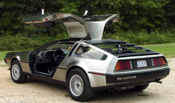
Delorean_DMC12 - All gull wing doors and stainless steel - But with a Renault engine hmmmm
DeLorean DMC12 - All gull wing doors and stainless steel - Chassis work by Lotus Engineering but with a Renault engine hmmmm

The film portrayal of the DeLorean has given it so much romantic kudos with no realistic chance of owning one. I am sure there will be loads of us old enough to have grown up with the films, who would simply love to be able to tell people that we drive a DeLorean.

I think the name alone is good enough to get people to take notice. The world PR would be incredible. If they allow the spec to stay high and the build and design to be impeccable and up to the world class standards that drivers now expect, there will be potential buyers queuing up to own one.

Good luck, we’re watching very closely.