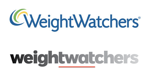
Sorry to be rude, but exactly how is the new logo for Weightwatchers an improvement over the old one? I have underlined the offending area of oversight in red.

Admittedly the old one was a little dated, but is this really better, more inclusive, younger, more dynamic, or does it just make the agency – Pentagram – look a little silly and the research they would have carried out look a little flawed.
Oh dear, oh dear, that’s even worse than the EE logo :c/
Wouldn’t it have been more appropriate to start with fat letters and end up with thinner ones….
I’m sure it would Viv. It probably would have looked better for it too!
I think the big fat belly hanging off the front of ‘Weight’ perfectly sums up the clientele.