The world’s best branding – a thought piece with video evidence

What does ‘best’ mean in a branding context? And is ‘best’ a defensible position or one you should even think about using as a claim?

Is it plausible, does it differentiate and is is it sustainable?

These would be three questions we would ask when we were looking at any strapline to work with, or support a brand and for us, in most cases. Best is just not good enough.

Case 1 – Seattle’s Best Coffee

As already discussed here, I think this is impossible to prove and almost completely implausible when they are faced with the might of Starbucks on their doorstep. I can see why they are making that claim, but don’t really believe they are Seattle’s best. You would hope however that if they are making such a ludicrously bold claim then it should at least be better than average and prepared with some care, skill and dexterity.
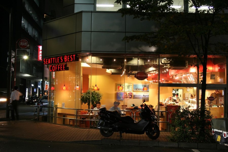
Seattle's best coffee and now in Japan?

Case 2 Gillette – The best a man can get?

When Gillette came to the UK, they briefed their agency BDO to look at, and work with, this strapline. BDO rightly pointed out that this was unprovable and as such, couldn’t be used in UK advertising. Gillette challenged this in court and the decision was that they were not claiming they were better than anyone else so therefore, anyone else could also be best too.

It was in effect, top parity. By being at the top themselves, they didn’t have exclusive ownership of that top slot and could share it with others. They have used it ever since in ads that I find continually irritating and tired. I also make a point of not using their products.

This ad from 1989 shows their thinking when they came to the UK with the first use of this strapline. For me, it shows how far we have moved in terms of advertising techniques and what worked then. It is awful, patronising and again, completely implausible. When did you last see an ad this cheesy?

Their brand tags show how effective its been for them however as you can see here

Case 3 – Elf (2003)

When Buddy (Will Ferrell) is wandering around New York, he sees a sign outside a crappy coffee shop and runs in to congratulate them. Later on in the film he takes his new girlfriend Jovie (Zooey Deschanel) for a treat at the home of the world’s best coffee. She is slightly unimpressed – again because it is so implausible.

Case 4 – BB Muffins Nottingham

I saw this today and laughed. If claiming to offer the best coffee in Seattle is a big claim, this one is plain stupid.
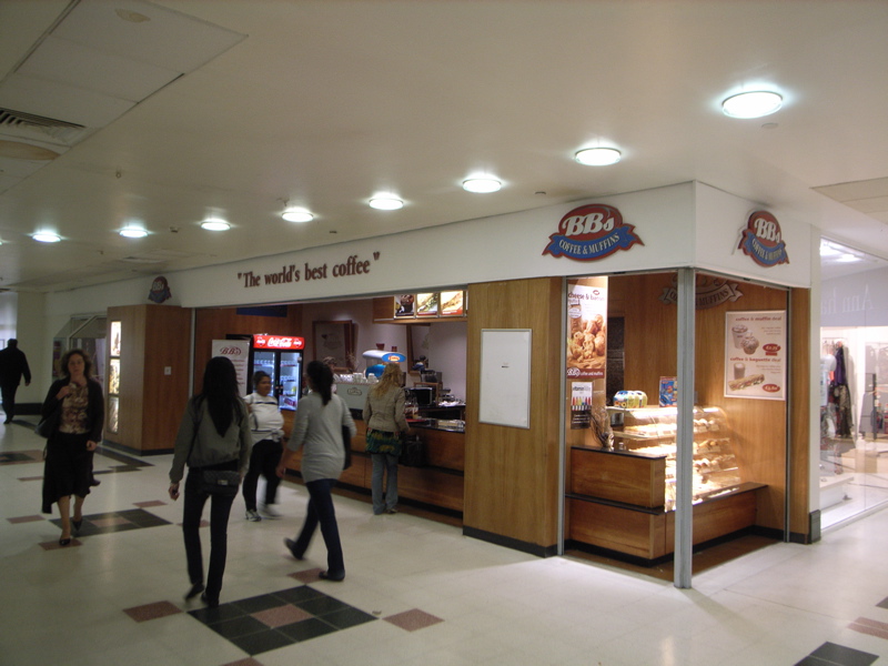
BB Muffins the home of the world's best coffee - and by law, their coffee is only actually as good as anyone elses!

It’s a bun shop that sells coffee on the side. For them to make a claim as the ‘world’s best’ is 100% ludicrous. I’ve never eaten or drank there, so I can’t vouch for their work, but it’s about as plausible a ‘world’s best’ as the one in Elf.

Case 5. Tina Turner – Simply the best

Hmm, not for me, but as we were talking about this in the office, they dared me to add this to the list, so I did. Enjoy it as it’s from her live tour in 1990 and she’s put on some years since then. Does the word ‘simply’ at the start help with her differentiation?

Summary.

Anyone can claim they offer the ‘world’s best’ as it isn’t a point of difference, it’s just a point of top parity.

To make this claim and deliver a product that is less than world class, will (hopefully) kill your brand forever.

Any brand has to have a clear and demonstrable point of difference, or people will not understand what they are about and what they should feel by having a ‘brand’ relationship with them.

‘Best’ isn’t good enough and ‘better’ normally isn’t provable, so where does that leave all these?

Who else can we add to the list of fame/shame as making brilliant/ridiculous claims to be the best?

Show me the videos or stills and I’ll happily link them off here. Have fun.

Thanks for the Seattle’s best shot to Cloganese. You can see more of his fine work here
The death of the Spanish brand

Spain has always been one of those places that people loved to hate. Torremolinos and Benidorm have been the butt of jokes, sitcoms and the building of concrete jungles since the early 1960’s when widespread air travel bought the sun, sea, sand and Sangria within reach of the masses.

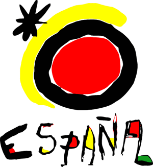
The best ever Icon that completely represents all of Spain's brand values

But when Spain started using the Joan Miró ‘logo’ to represent the Spanish brand, the whole offer started to make more sense. It had in effect, displayed its brand values in one beautifully simple representation to show that it was all about fun, easy living and a lovely relaxed style. For me, it is one of the most beautifully timeless ‘icons’ I have ever seen.

But then it all started to go wrong when they started trying to sneak in a few extra brand values, namely profit and perhaps even profiteering.

One of the attractions for us Brits of a Spanish holiday was always that it was incredibly cheap when we got there. Cheap beer, freshly cooked fish on the beach and change out of £20 for a family of four. The introduction of the Euro saw the first real move away from this with money pouring in from the rest of the Euro Zone and a move towards comparative wealth in the most popular destinations.

But then it all went wrong.

People rushed to buy the cheap apartments, being promised and initially seeing, spectacular growth in value, fuelled by the cheap flights of the low cost carriers. But as we’ve all worked out, there’s no such thing as a free flight and there’s certainly no such thing as a free lunch.

Sun, Sea, Sand and a pretty poor branded investment with a superb view over the motorway

Profiteering was rife. Land that was being bought for comparative buttons, was being converted to thousands upon thousands of Penthouse apartments, and in an exact mirror of the buy-to-let crash in the UK, there soon became a HUGE oversupply and the market tanked.

Where I was staying above La Cala, which was a lovely development, there were only one in eight apartments occupied. Around us in other developments, the figures looked much worse, with one opposite only having three occupiers in over 100 apartments – and that is in the height of their summer season. I personally know three people who are trying to sell (absolutely lovely) places in that region alone and all are now offering them at 40+% less than they were a year ago, with not even a sniff of a viewing, let alone any buyers.

The taxi drivers are reporting a 25% drop in traffic and the one I spoke to said he could not afford to have another summer like it. He had moved from selling timeshare, but he acknowledged, that dreadful mistakes had been made in the property market. Even the taxi market is massively oversupplied with over 400 taxis waiting at Malaga airport on one of the days I was there, for far too few fares.

The restaurants reacted by putting their prices UP, so that a meal for four is a struggle for less than 100 Euro. They too are reporting huge falls in numbers – which is hardly surprising either. The visitors seem to have reacted by staying away and buying from the supermarkets, which still offer remarkable value.

So Spain has completely trashed its brand values. It has stamped all over them and probably ruined them forever. Unless they can rebuild their business case with far fewer visitors and go back to their original values, their situation will get worse and worse and worse – and they already have 25% unemployment in some areas.

Spain is a lesson for any brand owner. Know your brand values, keep them steady and keep looking after your customers. Give them reasons to fall in love with you over and over again and never, ever put profit before quality.

Anyway, Turkey for me next year. If that’s not a Spain waiting to happen, I don’t know where is!

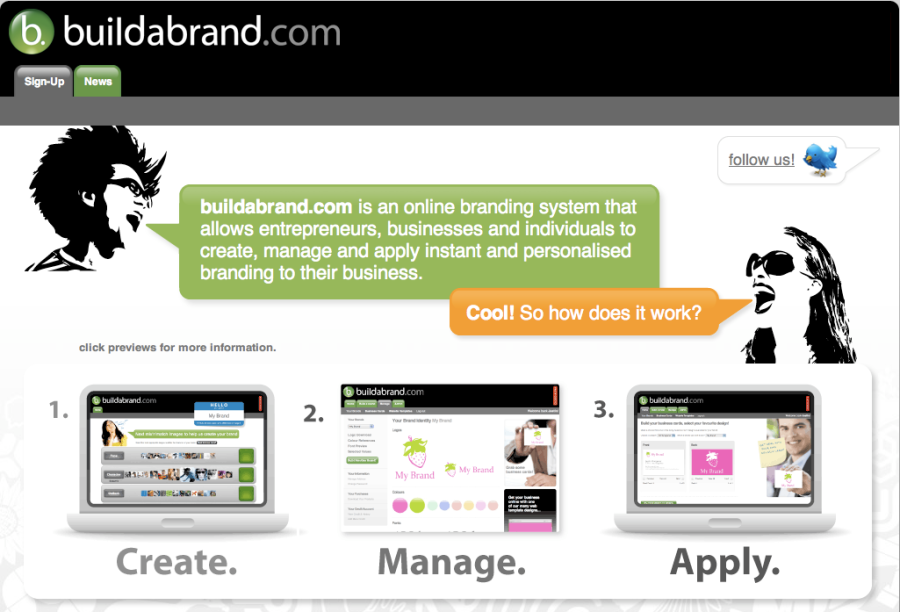
Buildabrand – Automatically generated branding?

I noticed a huge number of Retweets in one of my followed areas about a new beta experiment called Buildabrand.

Buildabrand - automatically generated branding?
Buildabrand – automatically generated branding?

According to their own blurb, it’s ‘an online branding system that allows entrepreneurs, businesses and individuals to create, manage and apply instant and personalised branding to their business.’

Wow, that sounds clever. Maybe even too good to be true.

You tell it what your name and values are and then it automatically generates a brand for you.

So, referring back to my previous post about what branding was and what branding is, it clearly isn’t a system to build a brand, it’s a system to sell you merchandise with logos on it.

Ever the cynic about systems like this, I have registered to se whether it will generate a new brand for me or for Purple Circle, so I’ll let you know if I get ‘accepted’ into their beta programme.

It seems like it could be a progression from the plethora of $50 logo sites out there, but it certainly won’t generate you a brand or anything close to a brand using their automatically, powered ‘algorithms’. (A pseudonym for seeing which logo they have in stock which seems the least wrong when compared to your values)

Years ago, I was on a TV programme called Love at first sight, which was quite like a low rent Blind Date. The idea was that you said some comical things about yourself and then Cupid, the Love Computer matched you to one of the three lovely ladies in front of you. What actually happened was that you wrote down on a piece of card which one irritated you the least and if they picked you too, you won a prize.

I suspect that the Buildabrand algorithm uses similar technology.

Building a brand is far more than throwing a logo at a set of values. It’s about living them in everything you do and the logo showing people they have arrived at the branded experience.

UPDATED

I added a link to this piece on Twitter and it obviously got picked up by the people at Buildabrand, who posted the following reply.

Buildabrand - reply via Tweetdeck
Buildabrand – reply via Tweetdeck

I think they do have a point in that they are lowering the barrier to entry for start-ups in that they may be able to produce decent logo design on the cheap. What they will not be able to do however is build a brand. They can possibly do one tiny element of what constitutes a brand.

My issue with this as a service is that they are claiming they can sell you something worth many thousands of £££’a for a few pence. Anyone who thinks they can shortcut their way to a brand is deluded.

Branding takes time effort and consistency, not throwing a few values into a computer and seeing what pops out.

UPDATED AGAIN

I have to give great credit to the people at Buildabrand in that they have clarified their position a little further in what is quite a brave piece directly responding to some of the criticisms that myself and others have levelled at them. You can read that here.

What they are now saying is that they are not trying to replicate what true branding agencies provide, but offering a low cost solution to those who need a quick and dirty logo for a project they are looking at but can’t afford to do properly. They say they have a bank of 1800 logo ‘solutions’ built up ready for the onslaught. Maybe I’m being unkind in saying that sounds remarkably like an adaptation of clipart (which is exactly what the likes of $50 logo do), but only time will tell.

I’ve applied for the beta, so lets see if I can get onto their scheme (now extended to 200 freebies from the original 50) and then set them a worthy challenge. I’ll let you be the judges, by sharing the results here – when and if I get selected. They are now following me on Twitter, so it will be a test for them to decide whether they want me as a customer.

What branding was and what branding is

When I started out in this industry back in 1990, I used to work on projects that were broadly in the area of corporate identity. This used to be about designing a new logo and then applying it to stationery and occasionally putting the logo on a jaunty angle on the side of a van.

This has slowly morphed into the black art of branding, which seems to have its hooks into every aspect of a business and its public face.

So whilst I was writing a presentation this morning about what branding now encompasses, I was surprised to see quite how far it had come in those 19 years.

Branding is about everything, including the kitchen sink

Branding is now about every aspect of the way an organisation presents itself, both internally and externally. You first have to win your staff over, to allow them to sell the message of what you do, and how you do it, to the rest of the world.

So this is a list of what we have worked on under the guise of a branding:

Brand strategy, naming, design, management and implementation covering all physical aspects such as signage, van liveries, staff uniforms, office and retail interiors, point of sale, packaging and exhibitions.

Literature, newsletters, annual reports, white papers, direct mail.

Advertising production, photography, image management, illustration, print management, copywriting, tone of voice and language guidelines.

Website design and production, social media marketing, search engine optimisation (SEO), email marketing, DVD and training film production, TV graphics.

Online PR, marketing research and brand insight, staff engagement programmes, public speaking on Brands and social media.

Merchandise management and strategy

Have I missed anything?

The real danger here is that working in a small agency you end up being mediocre at everything and many, many practitioners do (which is why you still see lots of dreadful work out there!), but I believe you have to have the confidence to hold the brand to its absolute core values and then work with close partners to deliver the specifics in areas you have less than expert knowledge.

Our role moves more towards the brand management and less to do with the specific deliverables.

Any brand that doesn’t cover off all its public and internal facing touchpoints is leaving itself open to problems of inconsistency from the outset, so it may be a good idea to use this checklist and refer back to your brand values.

Are all of them as good as they could be, or will a little bit of new brand thinking help get your brand properly branded?

To be a brilliant brand, you have to be brilliant at everything, not great at some and barely okay at others.

Thanks to Hoppetossen for the lovely Kitchen sink image. You can see more of his good work here.

WordPress is a brand that lives what it promises

Earlier today, I was helping a friend get a blog site set up, and as I have done before with my colleagues Mich and Abi, recommended that she do it using WordPress. I was telling her about how easy and foolproof it was to use and in the very best spirit of pride coming before a fall, I fell over. Big style.

I registered her blog, in her name, on my account.

That should be simple to move, surely all you need to do is delete it and then set it up in her name from scratch?

But you can’t. You have to contact customer services and I was dreading this. They were bound to be some faceless corporate who ignored my pleas for logic and common sense, who undid all my faith in their brand.

But no, just like all of their other brand behaviours, they were incredibly simple to use.

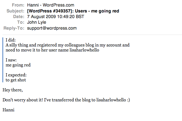
At 10.49 am I filled in the form, making it clear I was a bit embarrassed that you can see here. Even this is more nicely worded than almost any customer service contact form you have ever seen.

Wordpress customer contact form - showing my grovelling plea for help
WordPress customer contact form – showing my grovelling plea for help

13 minutes later, the very clever Hanni, replied back, having already sorted it, using the exact language you will find almost anywhere else throughout the WordPress site.

The helpful reply from the very clever Hanni at WordPress

Any brand that can be this consistent in delivering its brand values, deserves huge success. I’m not just a fan any more, I’m a raving fan.

Thanks Hanni.

UPDATED

Many online brands are absolutely awful when it comes to working offline, but just to continue this story one stage further, WordPress have again proved they are the most human of online businesses. As is my usual trick, I let Hanni know that I had blogged about her and I even got a lovely reply. I am now a raving fan with bells and whistles on.

I've made Hanni's from WordPress's day
I’ve made Hanni’s from WordPress’s day

Coca Cola Branding through the ages

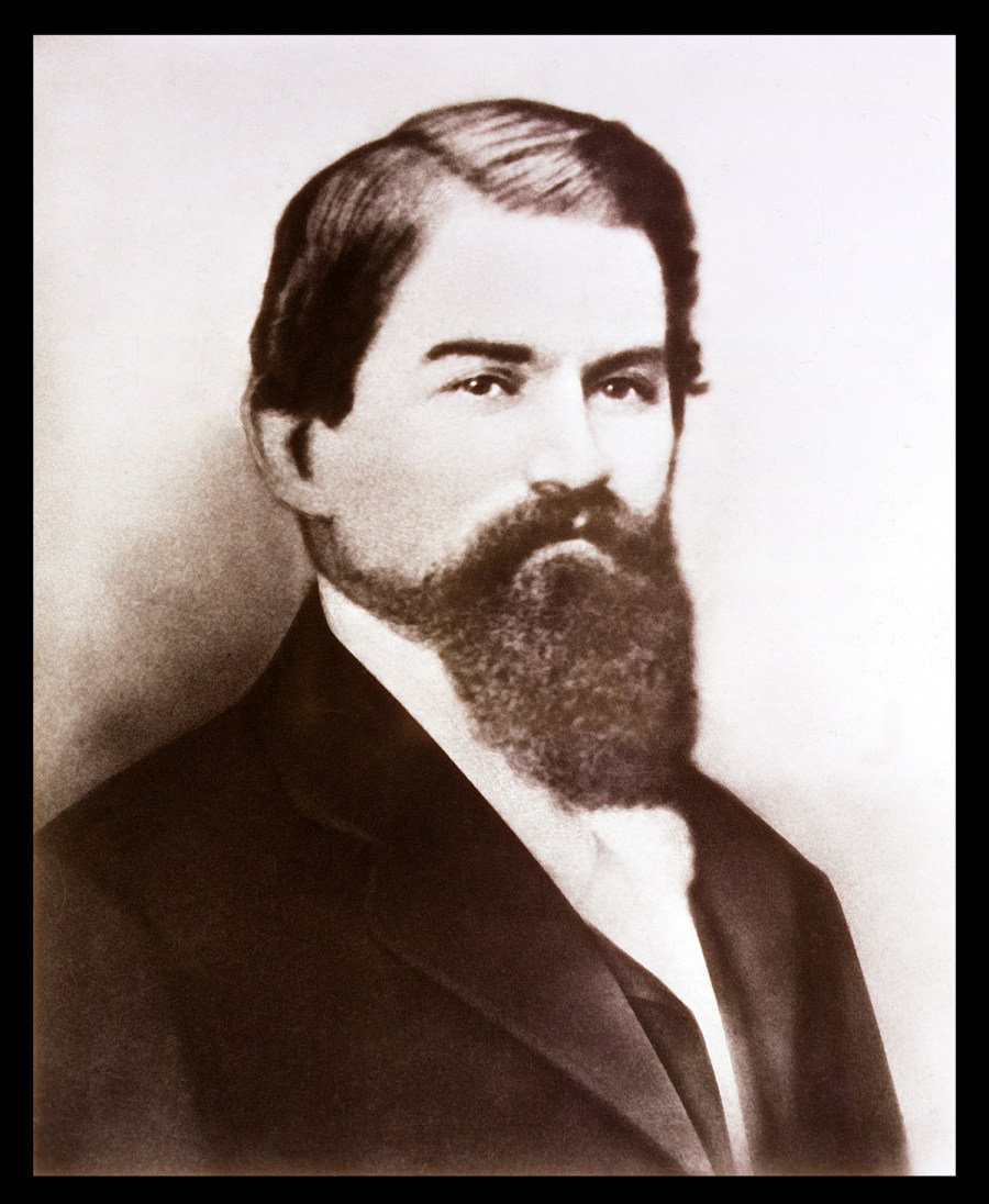
Dr John Stith Pemberton - Gave birth to Coca Cola and started the Cola Wars
Dr John Stith Pemberton – Gave birth to Coca Cola and started the Cola Wars

On May 8th 1886, a Dr John Stith Pemberton, a pharmacist, gave birth to the Cola Wars when he made a new syrup for the original Coca Cola and sold it down the road at Jacobs pharmacy. It was many years before it became the enormously powerful brand it is today.

What is one of the most interesting points for me however is that the logo element was actually produced by his bookkeeper who thought he could see something in the proximity of the two C’s and with his own scripted handwriting, created the logo for use in the Atlanta Journal to invite the citizens to try their new refreshing beverage. As you can see, this ‘logo’ is almost the same as the one we see today.

Meanwhile in 1898, over in New Bern, North Carolina, Pepsi was invented by another pharmacist Caleb Bradham. It was originally launched as Brad’s drink, but later became Pepsi Cola, named after the two main ingredients of Pepsin, the digestive enzyme and Kola nuts. Again it was aimed at a market looking for a refreshing drink that had some beneficial effects. The logos at this point are strikingly similar, to the point of Pepsi’s looking remarkably like a copy of Coke’s.

But around about here, their stories seem to split. Coca Cola stuck to their mission and continued to modernise to reflect the needs and desires of the era by changing the context of their traditional logo. Pepsi on the other hand, tried to modernise by constantly changing the logo and the context.

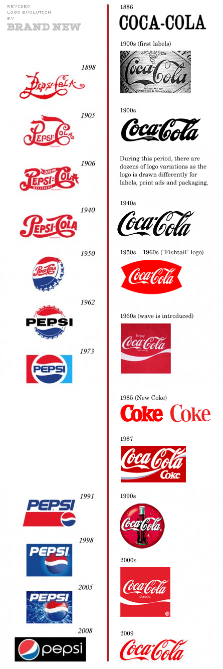
Pepsi and Coke logos throughout their history

In the 1980’s, during the time of Roger Enrico’s stewardship, Pepsi became convinced that their difference was their taste, spending the next ten years promoting just this one point and may even have been the reason that Coke, changed their recipe to one of their few historical mistakes that is ‘New Coke’. You can read a bit more about this here.

But by constantly trying to change everything about their product to appeal to become the choice of the (next) new generation, Pepsi effectively created a continual churn of their existing customers. The Pepsi logo that seems most relevant to me is the one from 1973 and the one for my kids will probably become the one from 2005.

The lesson here is simple. Coca Cola are the market leader and have been throughout their history. They have done this by continuing to build on their original values. The logo has evolved, but never changed so radically that it will lose its connection with the previous generation. Because of this brand continuity, Coca Cola will always mean something similar to each of us.

If you blind taste test Cola from Aldi at £0.25 per bottle and compare it to Coke at £1.09 per bottle, they are not that different, so like I said with the branding of cigarettes, it has to be to do with the brand that is the difference, or we would always buy the cheaper alternative. We don’t though, because the branded values dribble down on us and give us a bit of their magic.

Branding is not about logos, it’s about the consistent delivery of values to allow you to gain a feeling or emotion from it. The logo is only the symbol to show you have arrived at that branded experience.

The logo is therefore not the most important element of any brand, it’s the continual reinforcement of those values.

Pepsi’s mistake has been that by constantly changing the logo, they have changed the symbol of arrival.

As such, every time they change it, they create a level of uncertainty in a potential customer, rather like going into a pub or office you don’t know, that it may not be to your taste. You will naturally ask yourself ‘Will it be the Pepsi I know? Or have they changed it to make it more relevant to a new more exciting and younger audience? Will I look silly if I drink it? My very own equivalent of dad dancing in the wrong room.

Changing logos is a mistake, that Pepsi have practiced for year after year after year. For me, this is why they will always be trying to follow Coca Cola’s lead.

UPDATED

It would appear from new information that my previous chart showing the branding of Pepsi v. Coke through the ages was wrong. Shock Horror, they have actually changed the logo over the years. Not much, but still amazingly consistent considering the length of time.

Thanks to Under Consideration for doing all the hard work.

Coke and Pepsi logos through the years

Update 21 April 2016

It’s been announced that Coca Cola are undergoing a radical new look and feel again.  What is really interesting to me in this is that their idea of a radical rethink is to move some of the colouring around on their trademark bottles and cans. They are still leaving the logo element of the brand almost completely untouched as they have done throughout their entire history.

coke-bottles-april-2106
Coke updated bottles April 2106
coke-cans-april-2016
Coke updated cans April 2016

Innocent Smoothies ‘A Book About Innocent: Our Story and Some Things We’ve Learned – Book review

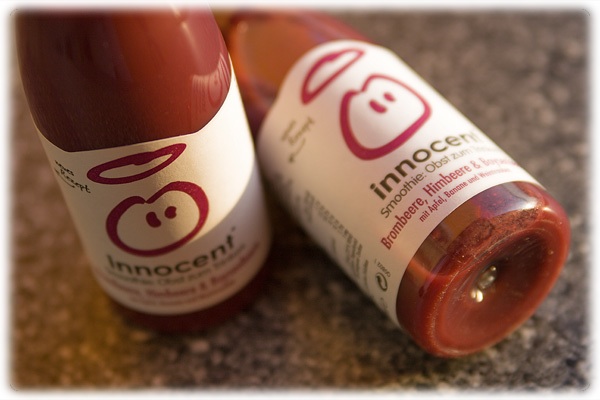
Innocent smoothies - everything you need to know about branding

There are few books that I have ever read that I have enjoyed more than this, because it is so obviously living its own values throughout every single element of the presentation.

From the beautiful simple writing to the clear, friendly design, it is a must read for anyone who wants to truly understand what branding is really about – from the masters of what branding is all about.

So what are the key learnings for me that came from reading and really thinking about what they are saying. Well, there are lots of them, but these are my top ten which made a real and lasting impression.

1. You don’t need masses of experience to start a business, but you do need an awful lot of determination and a brilliantly differentiated idea.

2. If you don’t get it right first time, it is not a failure, it is a potential lesson on the way to getting the right answer.

3. The beauty is in the detail. Its easy to do the big things right, but the differentiation comes in the small stuff that no-one else does like you.

4. Create a set of values that you really believe in and then deliver them ruthlessly at every single level of the organisation. Have fun, you spend a lot of time at work.

5. Recruit and retain brilliant people, even if they are not the same as you, but make sure you have a clear role definition for all of them.

6. Give people real responsibility to manage their own areas and then measure them on that. If they don’t measure up, help them move on.

7. Profit is not a dirty word, it allows you to continue to do more of what you do and live your values even more clearly.

8. Keep listening as you aren’t learning if you are talking. Look for inspiration everywhere, however random.

9. Keep evolving as a business as if you stand still you will slowly die.

10. Try new stuff. It may well work. If it does, do more of it.

Overall, this is a superb book that I found myself actually slowing down on whilst I was reading it so I wouldn’t finish it too quick.

Brilliant, just brilliant. You can buy your very own copy (and I urge you to do so, by clicking here.

And finally, thanks to the rather excellent ViZZZual.com for use of his image.

My new friend Rowena

Oh, and when you read it, look out for my new friend Rowena who is the very smiley one on the Banana phone in the front of the book. Hello.

Fine just isn’t good enough

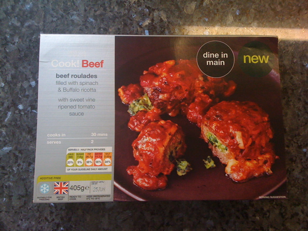
This is not a Beef Roulade, this is an M&S beef roulades filled with spinach and Buffalo ricotta

Marks and Spencer have been fighting back over the last few years with their strong campaign that says “its not just a thingy, its an M&S thingy” and it has felt like its been working. I only say this, because a brand essence has been really embedded when you hear kids and adults alike using the expression in everyday conversation.

Now M&S have been trying to help us in these recessionary times by reducing te price of the ‘Dine IN’ menu from £15 to £10.

But I have often argued on here and in other places that it will only work if the product your are peddling is actually as good as you promise.

Father’s Day yesterday and after a nice walk, what could be nicer than popping into our local M&S for their ‘Dine in for £10 deal’? Great idea but incredibly bland (at best and horrid at worst) food and that for me, is the start of the decline for the whole of the M&S brand.

We decided to start with the Beef Roulade.

mmmm Sounds nice.

It’s not a normal Beef Roulade remember, its an M&S beef roulades filled with spinach and Buffalo ricotta, served in a sweet vine ripened tomato sauce. (random capitalisation followed exactly from the packaging).

Unfortunately it wasn’t nice. It was pretty horrible and had the texture of a rolled up beefburger with some tangy cheesy peas stuffed up the middle of it.

The pudding was fine, the wine was fine and even the new potatoes were fine. But that’s it, they were just fine.

Fine is just not good enough. Fine is failing. Fine is forgettable and fine is feeling like I won’t bother next time.

To maintain or even grow a brand you have to do brilliant stuff, over and over again.

In the paraphrased words of Tony Parsons from his book Man and Wife, you have to allow your customers to fall in love over and over again.

When you make brand promises as big as M&S have been making, you have to not only wine and dine them, you have to be the perfect date, who brings flowers to you, says nice things to the future in laws and remembers all the little brothers and sisters birthdays. You have to be perfect. Not fine. Perfect.

My dine in for £10 meal was far from perfect. The main course wasn’t even fine.

It wasn’t just a meal and it wasn’t just an M&S meal, it was an entirely forgettable M&S meal.

Brian Howard Clough and the brand that is Nottingham

Brian Clough and his trademark green Jersey

I have just read the book ‘The Damned United’ about Brian Clough’s time at Leeds United. To any of you who have read this blog for a while, you’ll realise that I am a bit of a fan of Cloughie’s, so wanted to look at him as a brand to see what he stood for and what made him stand out – two vital elements for any branding programme.

I have read two others about him in the past and will now publicy claim to be one of the people that has edited his Wikipedia page to ensure historical accuracy.

The first thing that struck me was I could see why the family didn’t like the book as it paints Cloughie as a heavy drinking, smoking maniac – which he clearly was not. It does however paint him as a very strong family man – which I am far more certain he was.

So what did he stand for in a brand context?

He stood for straight talking – never letting anyone misunderstand what he was trying to say. Some of his quotes were just legendary – we will be referring to them for many, many generations to come. Perhaps it has taken losing him to realise the brilliance (and accuracy/honesty) of some of the things he said. Interestingly for us, this ‘straight talking’ came out as a feature of Nottingham people when we did the research for the brand for Nottingham back in 2005.

He stood for doing things brilliantly and his own way – whether this was as a father, a player or as a manager.

And for me, he stood for consistency. You always knew what type of reaction you were going to get – even if that reaction was to be an over-reaction.

These three values, would be the making of any brand these days – consciously or sub-consciously – any brand that did these three things would be half way to success.

So what made him stand out?

It could be the green jumper – a remnant of his time at Leeds if the book is to be believed – to get back at Don Revie who believed the colour green was unlucky – and is actually an old Leeds United goalkeepers jersey. All of the iconic pictures of the man show him in this top, from training ground to European Cup success with Forest. In his early days at Derby he was never out of his suit and tie.

But I’d like to believe that he stood out for just doing things so well. I met him once in a newsagent in West Bridgford and I was with my then seven year old daughter wearing her Forest top with her name on her back (a gift from the club to encourage young fans and financed by Capital One) and he was lovely to her. She stood there in awe as this enormously famous man, got down and spoke to her face to face – on her level – and she loved him for it.

You can see a different interpretation of his consistency and success living on through Nigel with his time at Burton and by what he seems to be quietly building at Derby County.

I think we all know, there was a bit of a wobble at the end. It all went a bit wrong at Forest and he lost a battle to drink – but so what? He was a slightly flawed genius.

But he was still a genius, who will be remembered for the great things he did, not the few bad things

Brian Clough is, for me, one of the best brands the City and the people of Nottingham have ever had. I think it is just a question of who is going to make something of it first.

Brylcreem needs to live its values

My 11 year old son Ted is playing Danny Zuko in a production of Grease. The house is full of tight fighting black trousers, tight fitting white t-shirt and a perfect leather jacket. So to complete the part with his hair (that he has been growing for two months) where else could I go but to Brylcreem. The haircare brand I would always associate with the era, the film and slicked back hair in general.

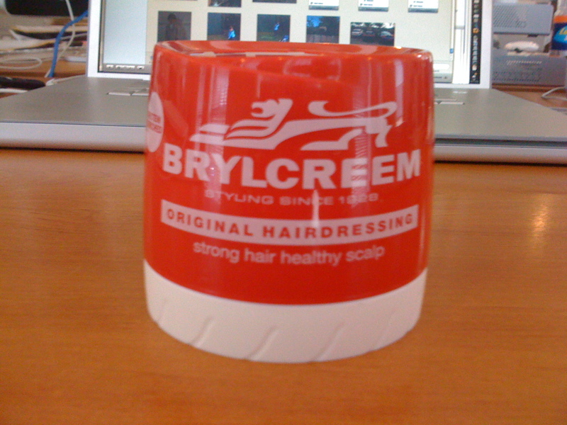
Brylcreem - Yours for only £1.00 at Wilko's - WHY?

Now, if you know me, you’ll realise that haircare products are not too much of a problem for me, being rather short in the barnet department. But I like to keep abreast of what’s going on in the world of brands and advertising. I’ve seen the latest ads for the product implying an effortless life, which just ooze coolness.

But when I went to buy some of the stuff in my local Wilkos (Wilkinsons to you and me) they had it discounted to £1.00.

Why?

For what reason did they need to do that?

How would that help them build their brand that they are spending a fortune advertising?

How would that reinforce the cool, effortless brand values they are portraying?

If they needed to shift some stock, why not add some value by bundling it with another product as a trial. They had a sister product (equally disinteresting to me in that it is more bloody hair gel) at £2.79, so why not add a mini trial product of their more premium product.

Why not get me to buy some of their lovely ‘Scruffing Paste’ – Because I need help getting my hair scruffy!

Everyone loves a bargain, but it will KILL your brand if you constantly discount.

Discounting damages brands and in an article I wrote back in February, my research showed it takes seven years to recover from a discounted price.

I bought a black comb too (again, not for me i hasten to add). They could have thrown that in couldn’t they?